Monday, December 10, 2012

Final Assignment

Space


Tools- Crop, Hue/Saturation, Levels, Burn, Sharpen
I chose this picture for spacing be it was different from the classic spacing that what taught to us in class. I felt that it represented spacing with the sheer number of people cluster in a small area and the vertical rise in their positions from their different height levels and the handrails. The picture caught my attention because almost every person in the shot what in the same outfit, which in the West Point Cadet jackets, and that they weren't acting like strict straight back military personnel; They are relaxed and enjoying themselves. I thought that this was a good picture to chose because it was the going against the classic image of the military and that it wasn't the expected spacing shot to turn in. The picture was cropped and then the levels were evened out. I upped the saturation on the yellow in the flags and lowered the saturation in the blue of the coats to make them the more natural gray. I sharpened the center of the picture and then burned the front portion on the photo.

Lighting and Shadow


Tools: Crop, Cooling filter, Levels, Hue/Saturation
This picture I took in my basement with a paper parasol back lite by a LED flashlight. I think this represents lighting well because I couldn't take alot of picture outside because of the weather so i created a situation that worked. The back light allows for us to see the spokes of the parasol as well as the supporting structure on the inside. If your looking at it from a distance you actually can't tell  whether this is a picture of the inside of the parasol or the outside, so its like an optical illusion. The created conditions allowed for pretty clear shadows and it isn't blurred. I cropped the picture so that the center was the more off to the side.  I changed the levels and made the black as black as it can be then added a cooling filter to remove most of that red ting on the paper. Finally I upped the blue saturation to increase the width of the blue circle on the outer rim of the parasol.

Rule of Thirds

Tools:Crop, Red filter, Levels, Hue/Saturation, Burn
Its Christmas time! I have had success with ornament pictures in the past so I thought this would be the perfect category for this subject. My sister and I have these old fashion ornaments that we got from our grandmother so I chose one of them to be the main focus. The composition of the picture was from an upward angle with the lights being the only source of light, I also made sure there was some of the Garland in there because it matched the ornament. I cropped the picture and set the levels. Then  I took the saturation down on the yellow from the lights and then upped the hue in the reds. I put on a red filter to highlight the red and finished by burning the surrounding tree and lights.
 
Personal Choice

Tools: Crop, Levels, Hue/Saturation, Texture Filter
I really loved this shot because it was perfectly timed; one second I had to take and the next there was someone standing in my view. Even though it doesn't look it, it was taken from the stands behind the end field and we had a perfect height for this. I was so excited bout this but i was disappointed to realized when I got back that it was slightly blurry because of the action. After cropping and fixing the levels, I" upped the hue on the yellow so that the grass actually looked green and the yellow popped. To cover for the excess blur I added a texture filter so it looked kind of like it was on canvas and that made the picture look sharp.
 
Nature

Tools: Crop, Levels, Hue/Saturation, Sepia Filter, Sharpen
It was hard to find something that was alive because on the winter season, so I went for something that was different. We have a massive amount of trees at my house, so naturally we had alot of nuts come down. I found a stock pile of empty shells on the ground a thought it would be perfect. I put my camera as close to the ground as possible with out it sitting down and focused on one acorn. I like that this nut seems to have the minimum amount of damage in the carnage around it. I thought this worked well for nature because it showed the winter season and what animals were doing to survive. I cropped the picture, leveled the shadows and upped the saturation on the yellow and downed the hue on the reds. To show off the browns in the shells I put a sepia filter on and sharpened the acorn slightly.


Wednesday, November 14, 2012

Personal Choice


i cropped this and burned the background to almost near black. i changed the light levels to add more shadows to the petals and with the water. the filter i used was craquelure on the background and saved the flower.

ICCA 11-14-12

the colors are very bright, the woman's coat is the first thing that I see because it stands out against the monotone of the rest of the picture. there is also the contrast between the red coat and the blue in the flag. it probably wasn't intended but there is a red white and clue thee going on in the picture. you can see the obvious distress in the woman's face so we can assume that she is the sister or widow of the person whom is being buried.  we know this is a funeral because of the folded flag and the emotions of the people in the picture. its a sad moment and should really be private for the family so i don't like this shot.

Monday, November 12, 2012

ICCA 11-12-12

I'm not really sure what is happening in this picture but i find it really weird. the colors are cool because you can see some of the lawns are dried up and brown. its also kind of interesting that you can see the divides in the land because of the mounds that run along them. the houses also kind of create a pattern, sporadic but a pattern. i like how the water seems to jet across the picture, like the shutter speed what fast enough to catch the moment but slow enough so that the streams seem like one piece. overall i don't find this picture very inspiring or have a lot to say abut it in general.

Wednesday, November 7, 2012

Walter Astrada photo analysis-Sam W, Shari B, and Brianna S

http://www.walterastrada.com/#a=0&at=0&mi=2&pt=1&pi=10000&s=11&p=1


this picture was taken in Guatemala, no definite city can be determined. What we assume is a woman is lying on the ground(possibly a street) mostly off camera after some attack, her shoes and her shawl/head-wrap removed. she has bruises on her legs that could be the result of a beating. the picture is mostly solid colors with muted tones, we believe that the picture was taken sometime in the afternoon possibly on a cloudy day. the texture of the concrete is a vivid backdrop for the harsh black of her slippers/shoes. you can tell her shawl is dirty and hasn't been washed because the fabric is dingy and the only real color is from the pattern on her dress and the sharp color of the rocks/dirt next to her.

the position of her body suggests that that she has been beaten, maybe raped, and is unconscious. the first thing that caught our attention was her feet because they they were the lightest color in the photograph. we were also drawn to the what looks like blood on her shawl because the red is the only other color in a photo of muted palate. from what we can see of the girl we think that she is between the teens and twenties because of the skin on her legs. the overall mood of the picture brings mixed emotions; angry, devastating, fearful. we can't see beyond her knees so we can't make any judgement on her face and there is not other ground in the picture but the concrete so we can't make any judgement about her where abouts.

we gathered from the photo that this is a young lady that has been the victim of an assault, we can not determine if she is unconscious or dead, and is seriously hurt. she either tried to fight back and run away because she was missing her shoes and shawl or she was taken by surprise in the attack and lost her shoes and shawl in the struggle. the way that the photo is taken it removes the victims emotions from the photo so the viewer is not influenced by their emotions. that angle at which it was taken we feel because it showed her bruised legs in contrast to the concrete and the blood on the shawl is in view as well, so the picture is not muddled with unneeded static. by removing the face and any other view other than the ground we as viewers are focused more on what may have happened and are not influenced by other factor. we are forced to draw our own conclusions about what happened based on the facts we are presented.

we believe this picture is very strong photo because it lacks a face to the victim and invokes a feeling of sorrow. we also get the feeling that this picture is a warning to womankind  about the threats against them as well as a symbol of violence that these women face in these countries.  so its very powerful.

Wednesday, October 24, 2012

critic of Shari Barger by Samantha Wagner

The first collage is of color, her choices were yellow and orange. The pictures did follow the guidelines that were set for us. Of the four pictures I like the tree and the fire hydrant the best because I think they are the best use of the colors she has chosen. I believe that she brightened the colors so that they popped more in each pictures, probable using the hue/saturation. The hydrant doesn't really fit in with the other pictures because the other 3 have more to do with nature and the hydrant is more industrial. But it the grass compliments the grass in the leaf picture so it still ties in somewhat. I find the depth of field in the pumpkin picture to be very well done and the framing in the tree picture is also done well. The leaf picture may have been more of a impact had the angle been steeper and more of the leaf filled the view. But over all its very good

The texture collage once again fills the parameters that we were set. The pictures seem to flow very well together because of the subjects are nature and all contain an undertone of green. The only one I would have removed would have been the stone wall because once again it doesn't really match the overall theme.  I really find the lighting in the corn husk to be fabulous because of the shadows cast in holes of the cob. The lower right hand picture and the vertical tree shot would have been in better focus. Especially the lower right hand picture, had it been in focus it would have been a really cool shot. The tree base shot is very well done because you can see all the layers and colors in the bark.

ICCA 10/24/12

Its sad. It inspires a feeling of captivity and restraint because the picture was taken outside of the barbed wire looking in. you can also make out that there is not alot besides the people and the barbed wire, you can actually see the barbed wire on the sides of the picture giving a feeling of isolation and separation. when reading the interview i thought it was at least compelling that they soldiers weren't going to leave the boy behind when they took his father and in the picture you can see that even in the horror that's happening that you can still find small pieces of compassion. the contrast of the outfits divides the father and son but give the feeling of a sort of balance. like yin and yang. the child is innocent of the crimes his father may have committed but they still exist with each other in co-dependence. the moment is not something that the photographer would have caught had he been chasing bigger news and i feel he was fortunate to be able to witness it. i don't think i would have been able to stand being stuck under the conditions that Jean-Marc, but then again i don't think i could report war news, its alittle too gruesome for me. but this picture makes me sad because i don't know whats going to happen to them. let alone how much time that boy is going to have his father after this. so yea its sad.

Monday, October 22, 2012

Color and Texture/Pattern

Texture

Color

ICCA 10/22/2012

i hate this picture. its very heart-wrenching because the boy is so young and is so exposed to the cruelties of the world. the angle of the sun makes it possible for you to count at least half the ribs and you can see the definition of the shoulder blades. the stark contrast of the boys skin to his jewelry is a nice detail. the main focus is the stand off of the vulture and the curled up boy. you can see from the angle of the shot that the bird is just waiting for the boy to stop breathing so that it can swoop in and have lunch. its taken outside in harsh sun most likely, probably in Africa out on the plains because on the foliage. its a powerful picture because it depicts the starvation of these people. but its so sad that i really cant look at it for long periods of time.

Wednesday, October 17, 2012

ICCA 10/17/2012

I know this picture!! Its of a middle eastern girl that was going against cultural opinions by having her photo taken. The intensity in her eyes is the most striking feature, the blue-green is really defined and alluring. The red in her head scarf is a natural contrast to the green wood in the background making us focus on her face because it is naturally framed.  You can see that she is slightly scared because of what she is doing and yet strong because she's doing it anyway. The soft light on her face doesn't distract from the picture because it doesn't create any harsh shadows. you can see that the head scarf/shawl is torn revealing the cloth underneath giving us the impression that she has a hard life. Thanks to the soft light you can also see the beginnings of age on the girl even though she is young. I like this picture and the one that was taken of her years later.

Monday, October 15, 2012

Landscape and Nature

original

 
retouch
crop, color saturation-higher red and lower yellow, heightened contrast, levels, cool filter, lasso to the top right corner to lower the yellow contrast

 
original

retouch
crop, made slightly brighter, levels, heightened contrast, saturation-defined reds and yellows, magnetic lasso for the sky and color corrected it to be more purple then grey, dodge tool on building

ICCA 10/15/2012

I like that it it in black and white, I find that it gives more character to the picture this way. You can see the color definition of the bricks and then shadows caused by the window sill. Its and action shot, where it looks like a woman and a child were out on the fire escape when it collapsed under them. The still shot its pretty cool because you can see not only the people falling but the potted plants as well. There actually looks like there is a haze coming from the top window, so if could have been a fire with them trying to escape. The lines from the fire escape drag the eye in the direction of the fall and gives the appearance that they are falling from a great height. Its also cool how you can see the different parts of the fire escape breaking apart mid air.

Wednesday, October 10, 2012

Panoramic-assignment 4


ICCA 10/10/2012

Whoa...that's the first thing i thought when i saw this picture, that and "god the must have hurt". its a very compelling photo because her nationality couples with the damage to her nose leads us to believe that she was punished for something. the color in the picture comes all from her head covering and that makes it kind of cool because despite how bad she must feel having to look like this, she is still trying to be pretty.  They angle of her head and face compared to the camera highlights they damage to her nose and that's what i feel the photographer wanted us to focus on. the model herself looks kind of uncomfortable to me by the set in her mouth and the guarded look in her eye; like she doesn't what to be there and have people documenting her. but despite her malformation/injury she is very pretty and has to be very strong to hold her head up and face the camera.

Monday, October 8, 2012

ICCA 10/8/12

this picture is very sad to me because it feels like the the holes are a collection of graves and the dog is lying next to the remains of his buried owner. The color of this picture is pretty cool, they way most of it is warm colors, brown red and gold. I also like the contrasting colors of the dog and wood from the rest their surroundings by being the brightest points in the picture. i also like the texture of the dirt in the dirt mounds and the sides of the holes. the holes give it depth and the line of them gives us a sense of space. the different shades in the dirt is also pretty cool. the picture just makes me sad because it feels like a mass grave.

Monday, October 1, 2012

Anthony Karen Discussion- Sam and Shari


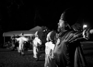
Alot of the KKK images were taken in the deep south, Alabama Georgia Arkansas Kentucky and etc, right in the occupants back yard. The people in the photo are all members of the KKK and are in attendance of some ritual, most likely the burning of a cross. They are imitating the burning cross and are photographed in a field of view were the main guy (possibly a high rank member) is in focus while the rest of the congregation is blurred. The photo is in someones backyard because you can see the house and car-port in the background and is taken in a landscape style, probably out in the country. Its in black and white which add dramatic-ism to the whole event and you can see what is happening without actually needing to see what has everyone's attention. they way the light is shadowing the picture also portrays what is occurring. In black and white you can tell how silky his outfit must be because of the shine and stitching, as well as he is the focus.

His face is what draws my focus first because he his very focused on what is happening off camera. Its almost an expression of awe or severe devotion and each person looks fearless. Their uniforms are different defining the status of the main subject from they rest of the people in the picture. His clothes are either purple, black, or red while everyone else has white and made from a heavier material. Also the other members outfit are different from the next, one has more strips at the bottom of his roles and wears as sash while the other two does not. They just have a tie around their waist. Their hats are also different, the 3 men have hats made of fabric while the girl(?) has a hard hat. The age difference between the members makes me feel as if they are a family in communal worship and the main focus is the oldest of the four figures while the is right seems to be the youngest member. he's almost setting the example and is the head of the house. It's night time by the street lamp and the feeling is that they are very focused on what they are doing.

From what we can see it is obvious that the members are participating in an event, possibly burning a cross. The intent of the photo was to show the perspective of worship in the Klan and how each person in broken down by rank by their clothing. Visible status. The picture was taken at this angle because it shows that the main focus is of higher rank then the rest and that is authority is more powerful. He probably left out the event their witnessing because he wants us to focus on the people not what they are doing. The members become the focus as individuals rather then what they as a Klan does as a whole.

Its a powerful picture because it reveals that what most people believed disappeared after the civil rights movement is still happening. The picture shows that while we all have our differences there is still some that are so close minding in their views of what society should be and whom it should be made up of. We believe that its a very significant photo story because it brings to light what a lot of people would rather ignore. It did add to some of our knowledge because we didn't realize that the Klan was basically a church and they where just worshiping under certain values. We might not agree with those values (any of them!!!) but it still has to be seen and someone had to do it. Just glad it wasn't us....

Wednesday, September 19, 2012

critic of Amy Siter by Sam Wagner 9/19/2012

I am looking at Amy's works and I'm liking the direction that the crossing lines are pulling the eyes. the shadow is kind of understated when compared to the movement of the piece. the retouch of the parking likes i like better because the first picture lacked in color so the monotone wasn't very appealing but adding the yellow gave it a nice pop. her second picture is interesting because the large of the shadows cuts the picture making the focus more on the chain links and their shadows. there is also some slight texture in the mud prints and in the tarp on the fence. the crop really cuts the angle down so there is not alot of empty space which dominated the original of the picture. the focus on the pattern was cool and even the shadows on the fence itself makes it interesting to look at. changing the color of the tarp was nicely down didn't miss any spots or drag out. over all i like the way both pictures drag you eye in a directions rather then having to focus on one spot.

i really would have liked to see the pictures she took in the trees. the first one looks cool with all the lighting behind the trees making the front sides seem dark. i would have kept it in black and white too. makes it look more dramatic. the other one i would have used would have been the picture of the 2 willow trees. i think the way the light would have differed on the leaves would have looked cool if she had cropped it close. the different lighting on the leaves would have given it an air feel and would have made me think of being outside on a nice day.

http://alverniafa12photositer.blogspot.com/

Shadows and brush


Wednesday, September 12, 2012

ICCA 9/12/12

i like the color contrast of the two skin tones. it makes me wonder if the dark hand is attached to a living person or a mummy because it looks a little...dead. i like the detail you can see in the one hand and how you can see the bones. also the way the white hands fingers are slightly darker then the rest of the hand makes for a cool visual comparison on what he's doing. so i guess the smaller had is dead. looking at the background in looks like they were digging. the focus is wonderful and brings out the details. i really like this picture, the subject is intriguing.

Monday, September 10, 2012

Space and retouch


ICCA 9/10/2012

Is that a tightrope walker? Its kind of vague because of how far away the the subject its but i like the black contrast of the shapes to the blue sky. I feel it would have been more of an impact had the picture been closer but i think that the asymmetry of the buildings gives it a feel of an optical illusion. your not sure which way the persons walking and that makes me wonder is he almost there or just starting. i just don't like the distance between the subject and the camera is. also from where i'm viewing the photo looks to me slightly out of focus and theres more definition on the buildings then the walker. all together its not bad, just not interesting.